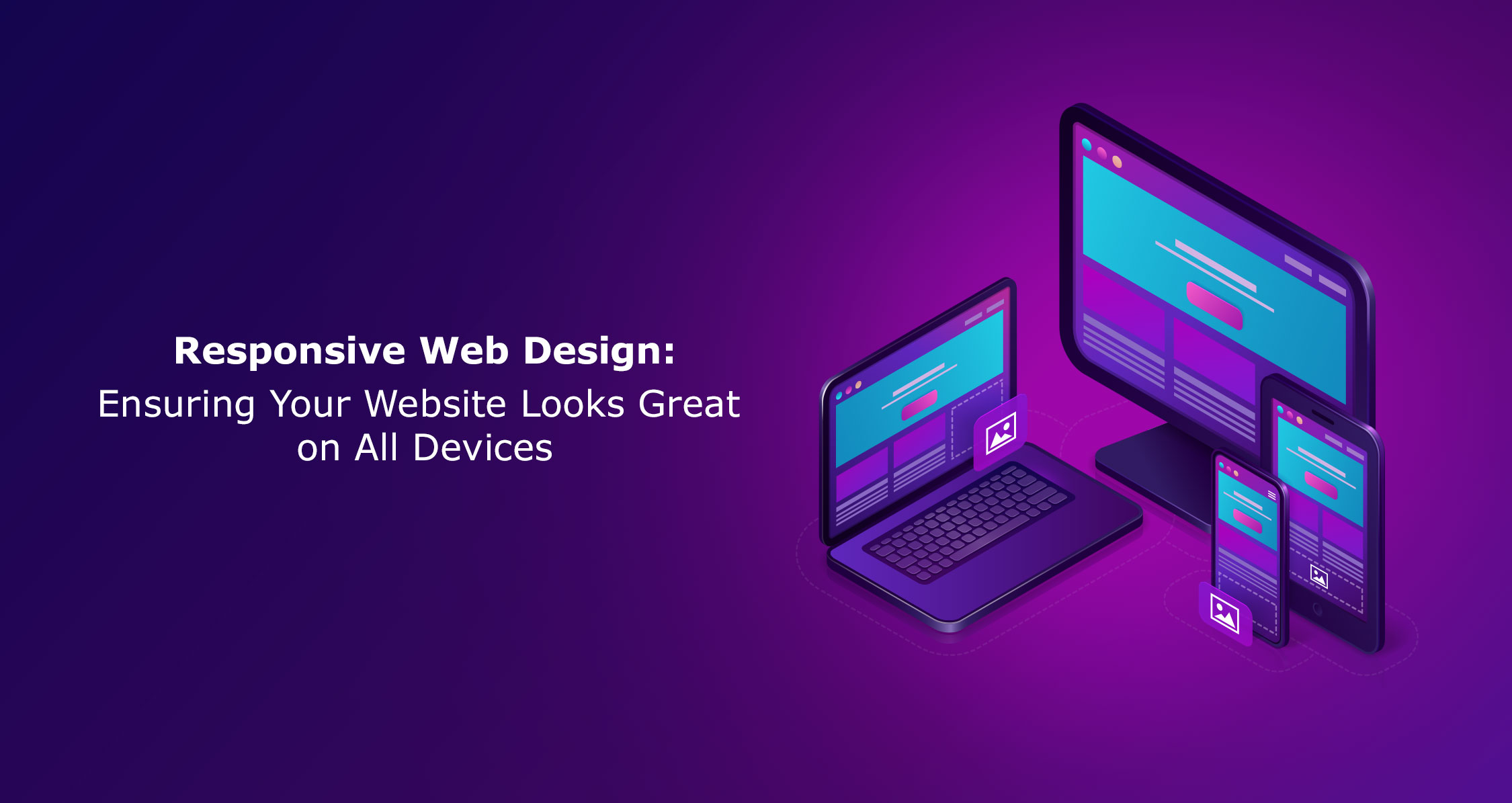
Image Credit: Image by upklyak on Freepik
Responsive web design is an approach to web development that ensures a website looks and functions seamlessly across all devices and screen sizes. It involves creating a flexible and adaptable layout that can automatically adjust to fit different screen resolutions, from mobile phones and tablets to desktop computers. With the rise of mobile internet usage, having a responsive website has become essential for businesses to provide a consistent and user-friendly experience to their visitors.
THE IMPORTANCE OF RESPONSIVE WEB DESIGN
In today’s digital age, more and more people are accessing the internet through their mobile devices. According to recent statistics, mobile internet usage has surpassed desktop usage, making it crucial for businesses to prioritize mobile-friendly design. A responsive website ensures that no matter what device a user is using, they can easily access and navigate through your website without any usability issues. This not only enhances the user experience but also improves your website’s search engine rankings, as search engines like Google prioritize mobile-friendly websites in their mobile search results.
BENEFITS OF A MOBILE-FRIENDLY WEBSITE
Having a mobile-friendly website offers numerous benefits for both users and businesses. Firstly, it improves the user experience by providing a seamless and optimized browsing experience, regardless of the device being used. This leads to higher user engagement, longer visit durations, and increased conversion rates. A mobile-friendly website also boosts your website’s visibility in search engine results, as search engines favor mobile-friendly websites and rank them higher. Additionally, a responsive website eliminates the need for multiple versions of your website, simplifying maintenance and reducing costs in the long run.
MOBILE OPTIMIZATION BEST PRACTICES
To ensure your website is fully optimized for mobile devices, there are several best practices to follow:
- Prioritize simplicity and minimalism in your design as cluttered layouts can be difficult to navigate on smaller screens.
- Use large and easily tappable buttons and fonts to improve touch interactions.
- Optimize your images and videos for faster loading times on mobile networks.
- Utilize caching techniques to reduce load times and improve overall performance.
- Test your website on a variety of devices and screen sizes to ensure it looks and functions as intended.
- Regularly update your website with fresh content and keep up with the latest mobile trends to stay ahead of the competition.
IMPLEMENTING A MOBILE-FIRST APPROACH
Implementing a mobile-first approach is a crucial aspect of responsive web design. By starting with the mobile version of your website, you ensure that the most important content and features are prioritized for mobile users. This approach forces you to simplify your design and prioritize essential elements, which in turn leads to a better user experience on all devices. It also helps in optimizing performance, as mobile devices typically have slower internet connections compared to desktop computers. By focusing on the mobile experience first, you can ensure that your website is fast, user-friendly, and accessible to all users, regardless of the device they are using.
UNDERSTANDING VIEWPORT SETTINGS AND FLUID LAYOUTS
Viewport settings play a significant role in responsive web design as they determine how a website is displayed on different devices. The viewport meta tag, when added to the HTML head, tells the browser how to scale and adjust the content to fit the device’s screen size. This ensures that your website looks and functions correctly on both desktop and mobile devices. Fluid layouts, on the other hand, allow your website’s content to automatically adjust and fill the available space on the screen. This flexible approach ensures that your website’s design is not fixed to a specific screen size, but rather adapts to the user’s device, providing a consistent and optimized experience.
CSS FRAMEWORKS FOR RESPONSIVENESS
CSS frameworks are a valuable tool for creating responsive web designs efficiently. These frameworks provide pre-built CSS classes and components that are designed to be mobile-friendly and responsive out of the box. Bootstrap and Foundation are two popular CSS frameworks that offer a wide range of responsive components, including grids, navigation bars, forms, and more. By leveraging these frameworks, you can save time and effort in coding responsive layouts from scratch. They also ensure that your website’s design is consistent and visually appealing across different devices, providing a seamless user experience.
ENSURING BROWSER COMPATIBILITY AND CROSS-DEVICE COMPATIBILITY
When designing a responsive website, it is essential to ensure browser compatibility and cross-device compatibility. Different browsers may interpret your website’s code differently, leading to inconsistencies in the layout and functionality. Testing your website on multiple browsers and devices is crucial to identify and fix any compatibility issues. Cross-device compatibility, on the other hand, ensures that your website looks and functions correctly on various devices, including smartphones, tablets, and desktop computers. By thoroughly testing your website on different devices and browsers, you can provide a consistent and optimized experience to all users.
Conclusion:
In today’s mobile-dominated world, having a responsive web design is crucial for businesses to ensure their website looks great and functions seamlessly on all devices. By implementing a mobile-first approach, understanding viewport settings and fluid layouts, and utilizing CSS frameworks, businesses can create mobile-friendly and user-friendly websites. Designing for different screen sizes with breakpoints and media queries, ensuring browser and cross-device compatibility, and following best practices for multi-device design are essential for a successful responsive web design. By using tools and resources for mobile optimization and keeping up with the latest trends and advancements in responsive design, businesses can future-proof their websites and provide a consistent and optimized user experience. Embracing responsive web design is not only essential for staying competitive in today’s digital landscape but also for delivering a superior user experience to your website visitors.
At GoPhygital, we specialize in creating bespoke solutions that meet your specific requirements. Let us help you bring your idea to life. You can reach out to us here.